Insider Spotlight
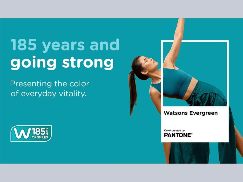
The company said it has introduced “Watsons Evergreen” in partnership with the Pantone Color Institute—the world’s leading authority on color—turning the color long associated with the retailer into a standardized brand element that will be used across markets.
The campaign will roll out in 16 markets across Asia, Europe and the Middle East through customer and community activations, as well as a curated product range.
Why it matters
Brand colors have become increasingly important in helping companies create consistent customer experiences across physical stores, digital platforms and product packaging. Watsons said the initiative aligns with its purpose of helping customers “Look good, do good, feel great” every day.
The details
Watsons Evergreen is described as a vibrant blue-green hue symbolizing everyday vitality, care and reassurance. The company said the color has already been present across its logo, store design, merchandising displays, digital channels and own-brand products, with the Pantone collaboration defining it as a global brand asset.
“For 185 years, Watsons has helped customers feel healthier, happier and more confident in their daily lives. Watsons Evergreen captures that role in a simple yet powerful way. By partnering with Pantone, we've transformed our iconic brand colour into a global symbol of vitality, care and wellbeing that will connect customers across every Watsons market.” Watsons International customer director Jared DeGuzman said in a press statement.
“Watsons Evergreen captures the essence of a brand that has stood the test of time while continuing to grow and evolve. It is a colour that speaks of vitality and longevity, and of a deep, lasting connection to the customers and communities Watsons has served for generations.” Pantone Color Institute vice president Laurie Pressman said.
By the numbers
Watsons operates more than 8,000 stores and over 1,500 pharmacies across 16 markets. Parent AS Watson Group has more than 17,000 stores across 31 markets and reported over $26 billion in revenue in fiscal year 2025. In the Philippines, Watsons operates more than 1,200 stores as of January 2026. —Vanessa Hidalgo| Ed: Corrie S. Narisma